Tipple

Brand Identity | Illustration | Digital Assets
Project Overview
This project focused on creating the brand identity and digital assets for a cocktail bar. I wanted the design to cultivate a sense of play and intrigue by including modern aesthetics with a vintage twist.
The Logo
The typeface I used for the logo is inspired by the first edition version of cocktail book ‘Giggle Water’, written in 1928 by Charles S. Warnock. I wanted the logo to feel lighthearted and playful, with the letters being at different levels imitating ice in a glass.
Creating the look and feel of Tipple relied heavily on the illustration style. I wanted the sketched hands and drinks to capture the playful and artistic mood of the bar. The iconography offers a slightly less stylised illustration which compliments the sketchiness of the main illustration style.

The colour palette consists of a burnt red through pale dusty pinks and whites. I wanted the main colour to feel bold and deep.
Illustration
Iconography & Colour

MAIN COLOURS

E7D1CC
Shell Pink
CEA39A
Dusty Pink
983C29
Burnt Red

50% OPACITY

E7D1CC
Shell Pink
CEA39A
Dusty Pink
983C29
Burnt Red
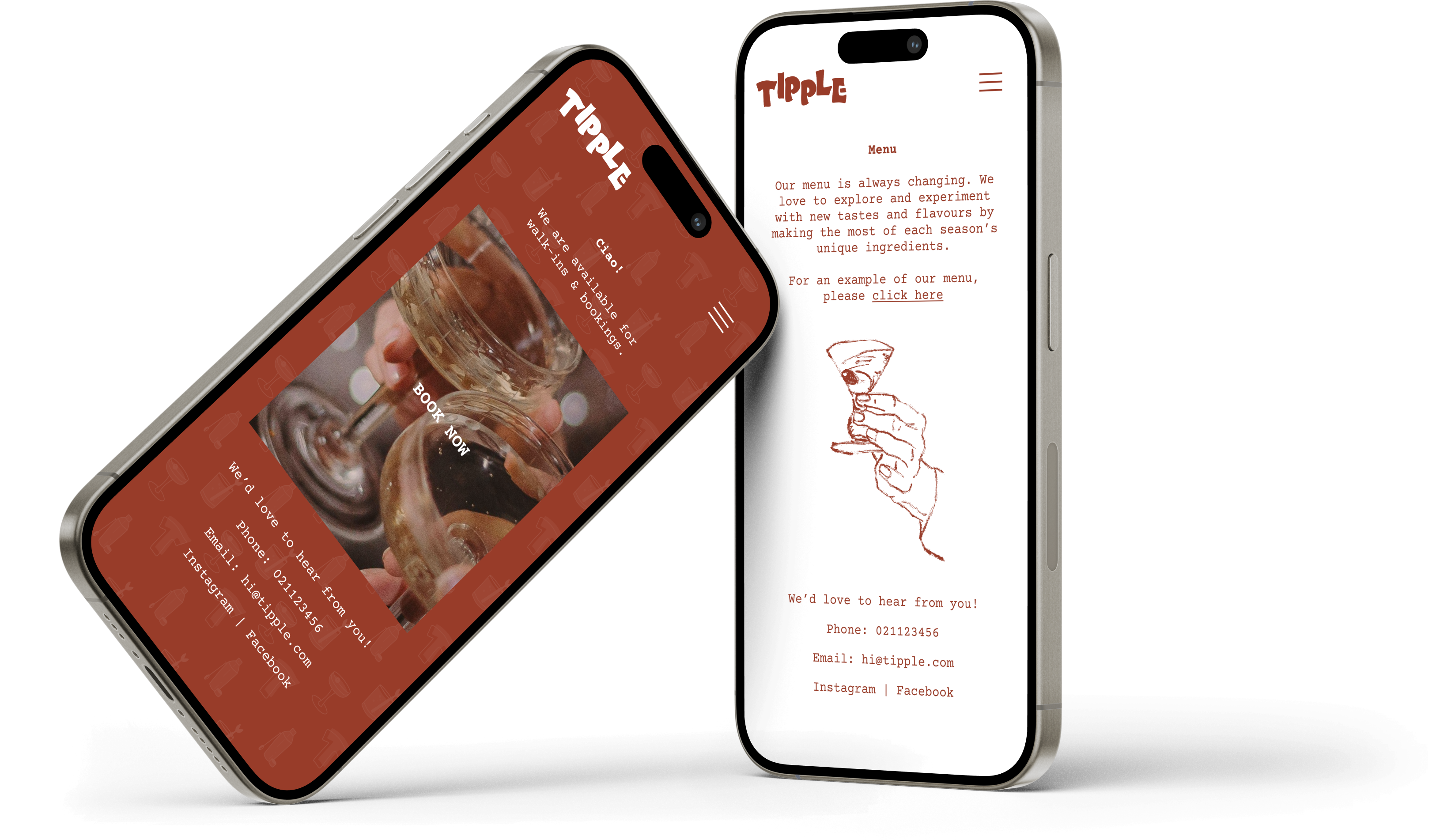
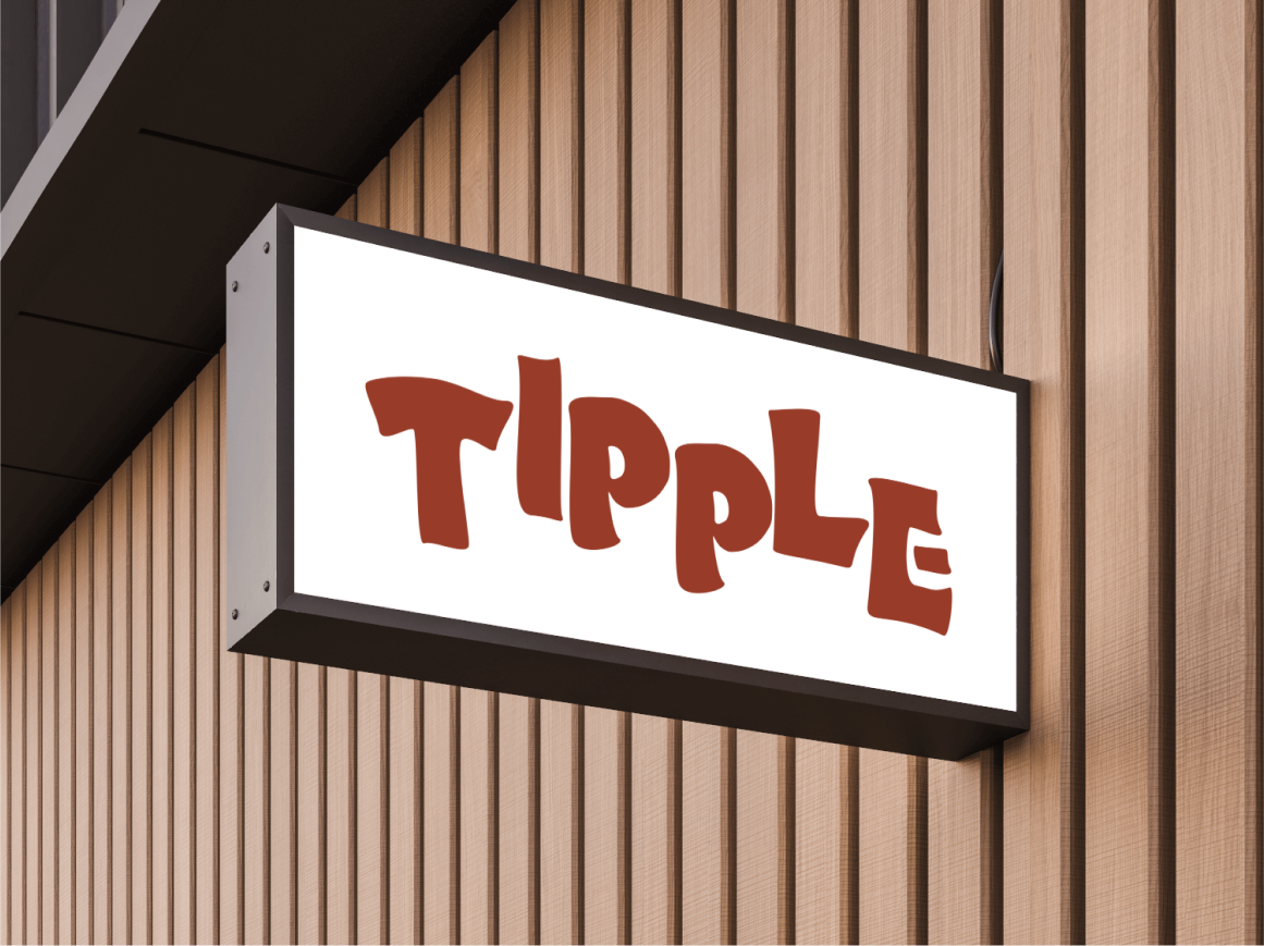
It was critical to create a website that customers could access and immediately get a feel for the bar. Bookings and a page explaining the seasonal menu were the two main features.

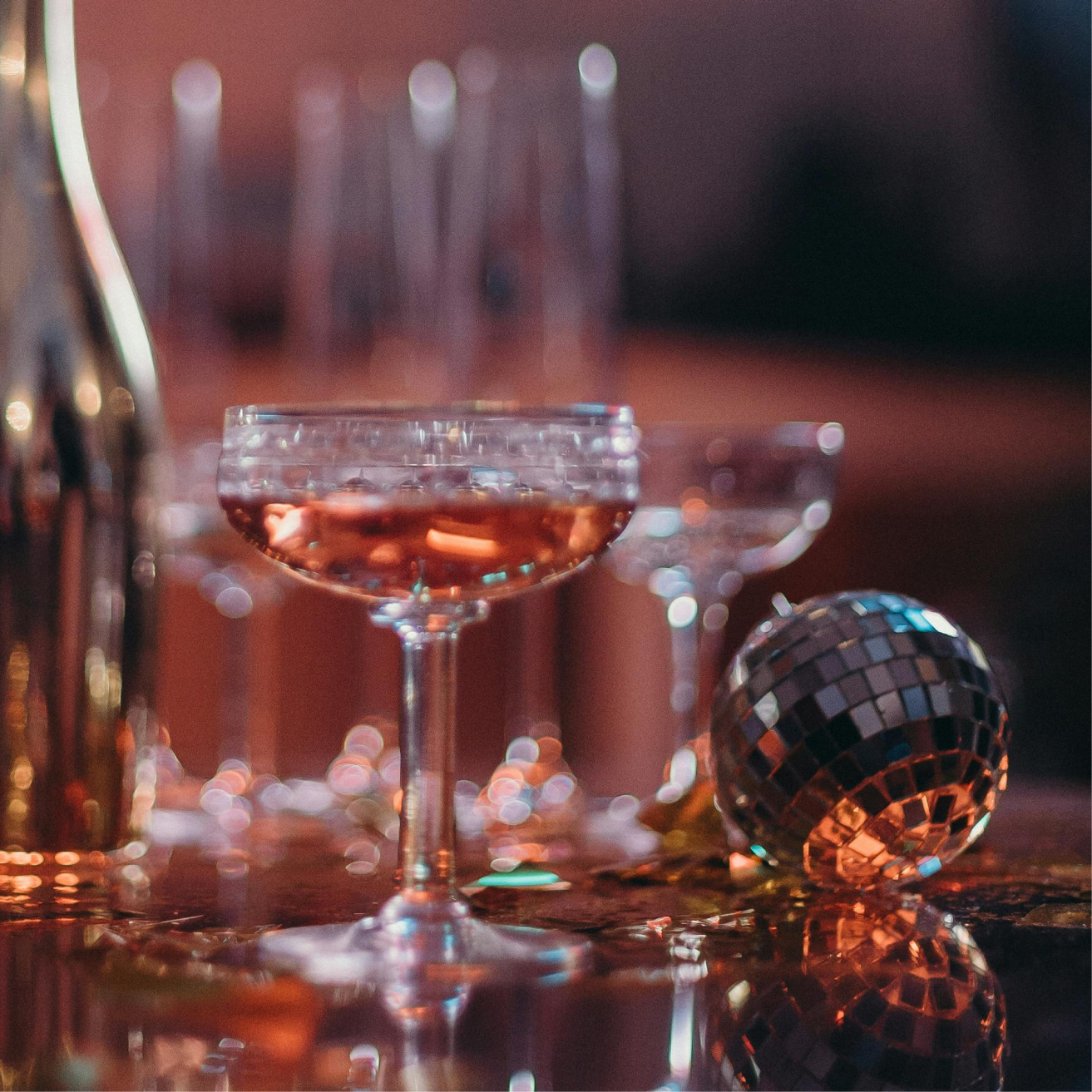
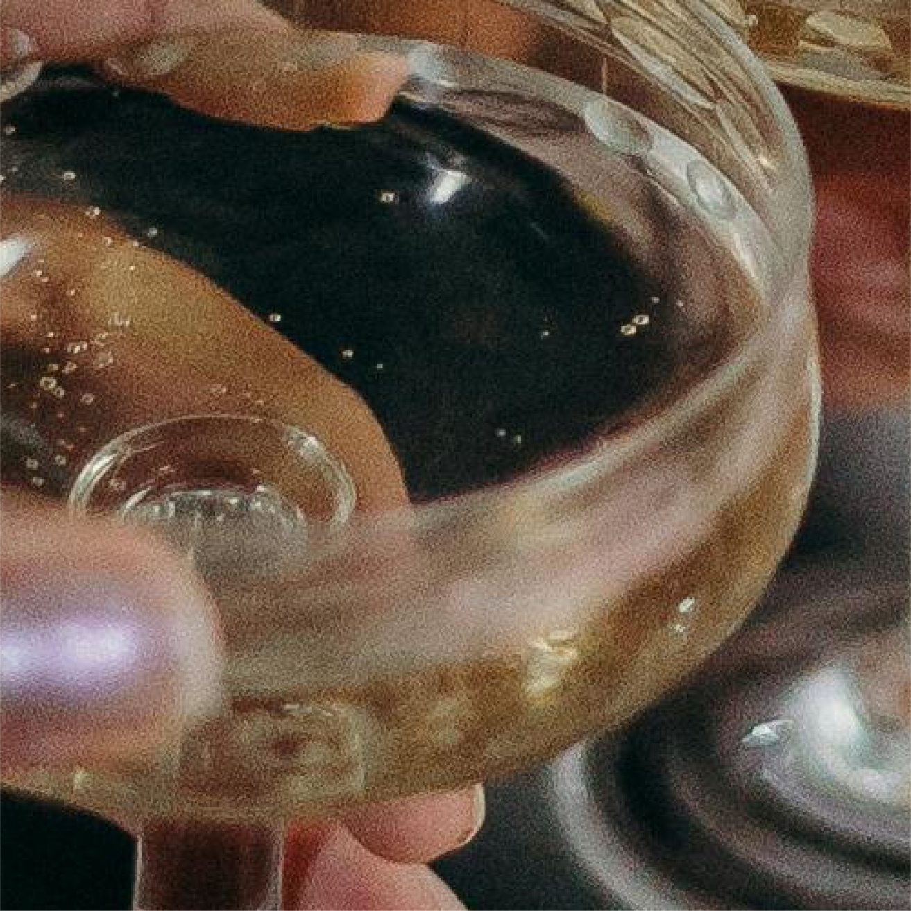
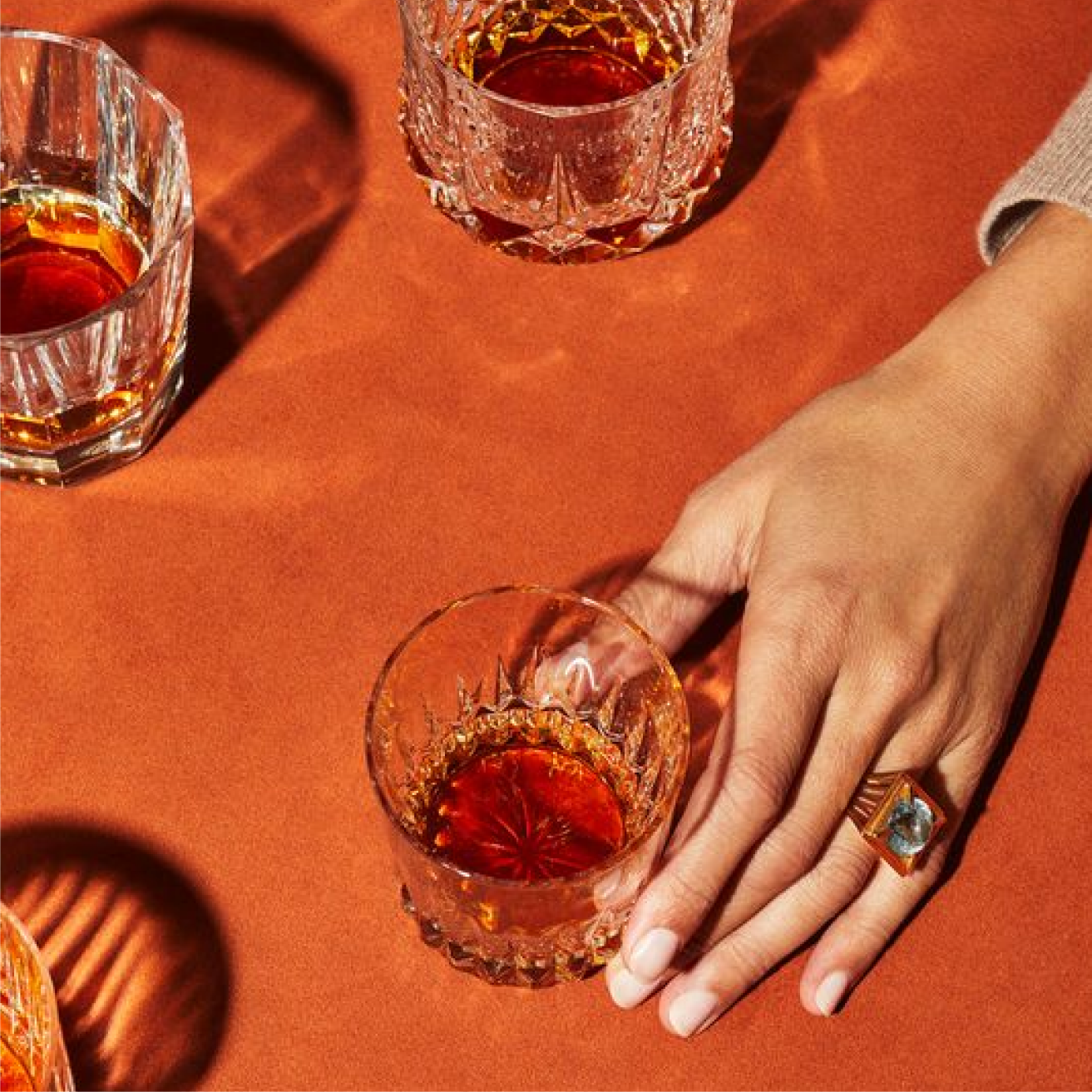
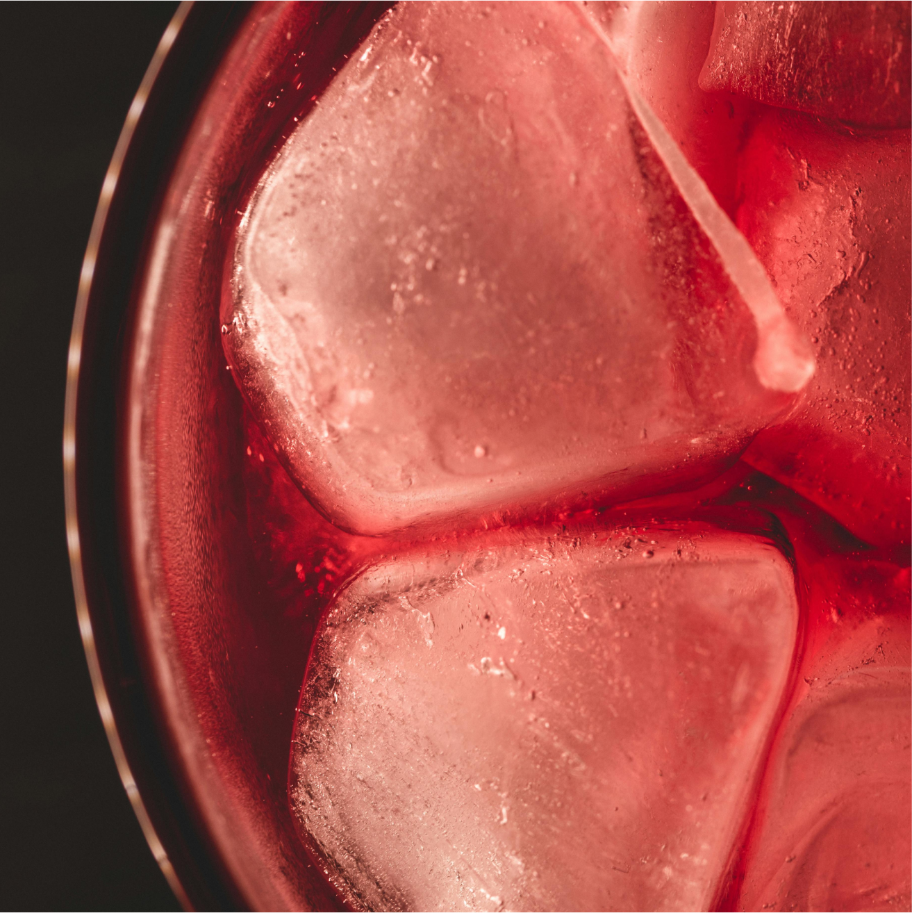
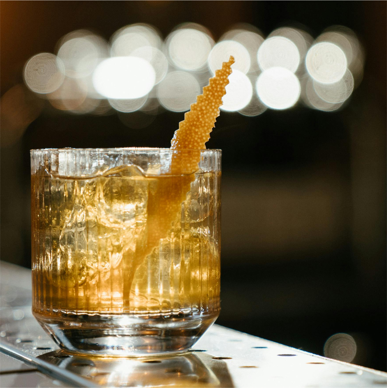
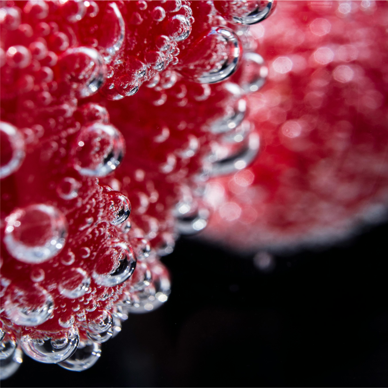
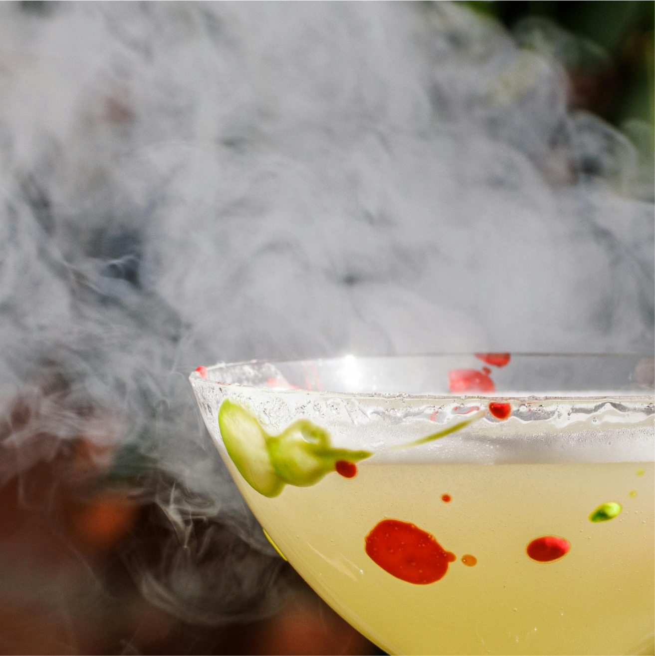
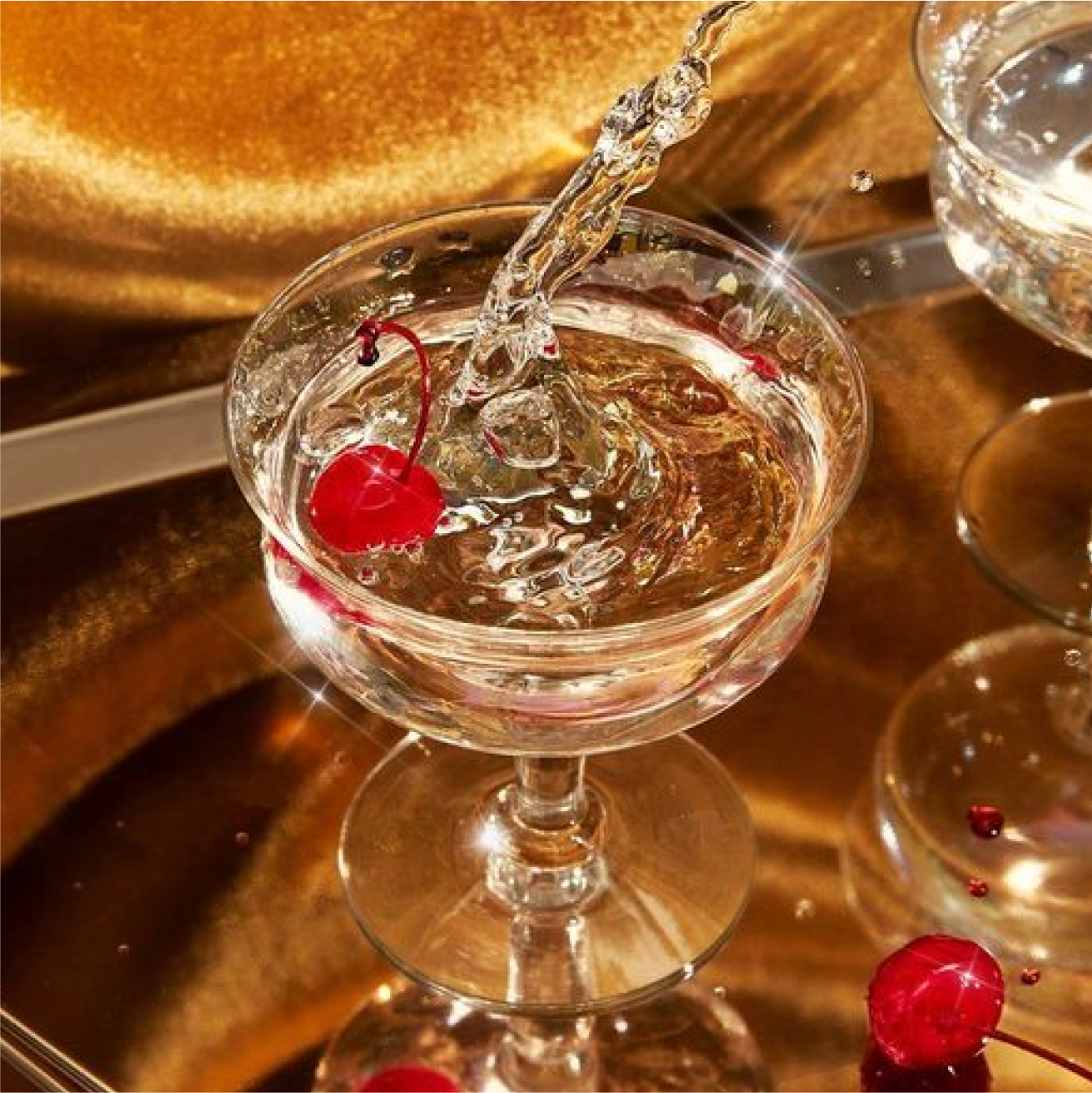
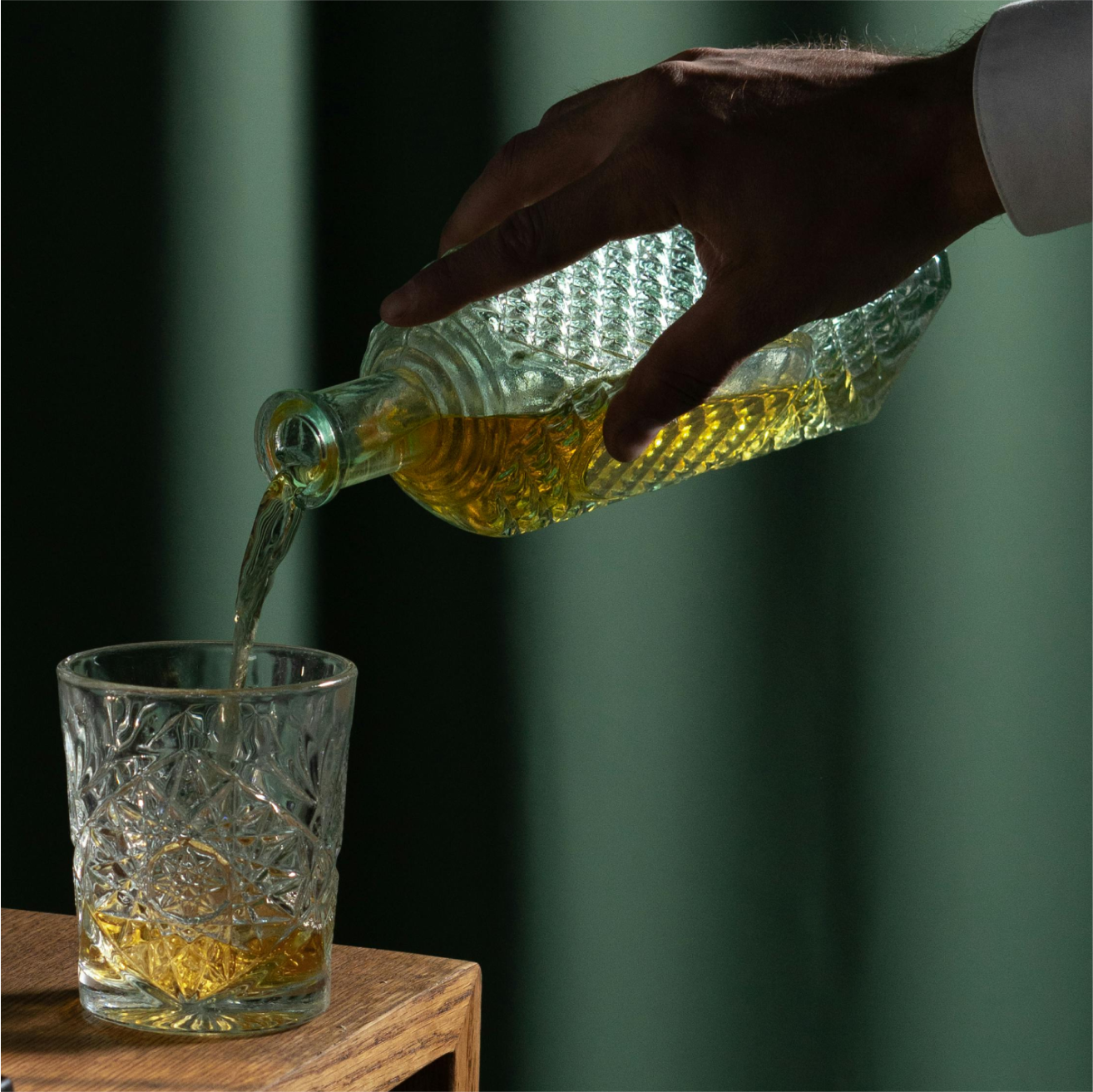
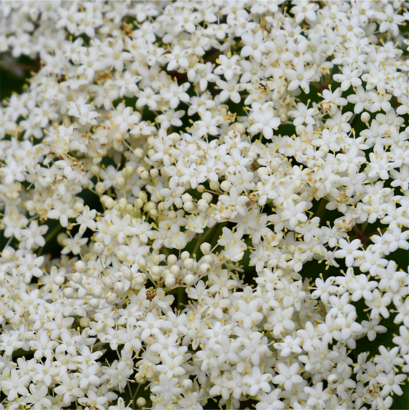
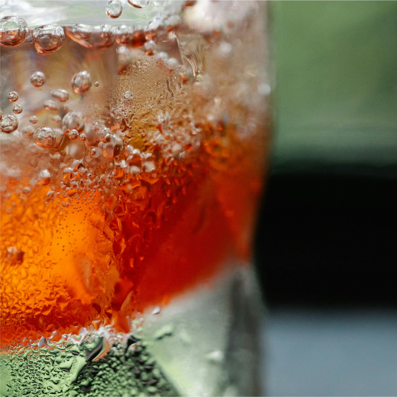
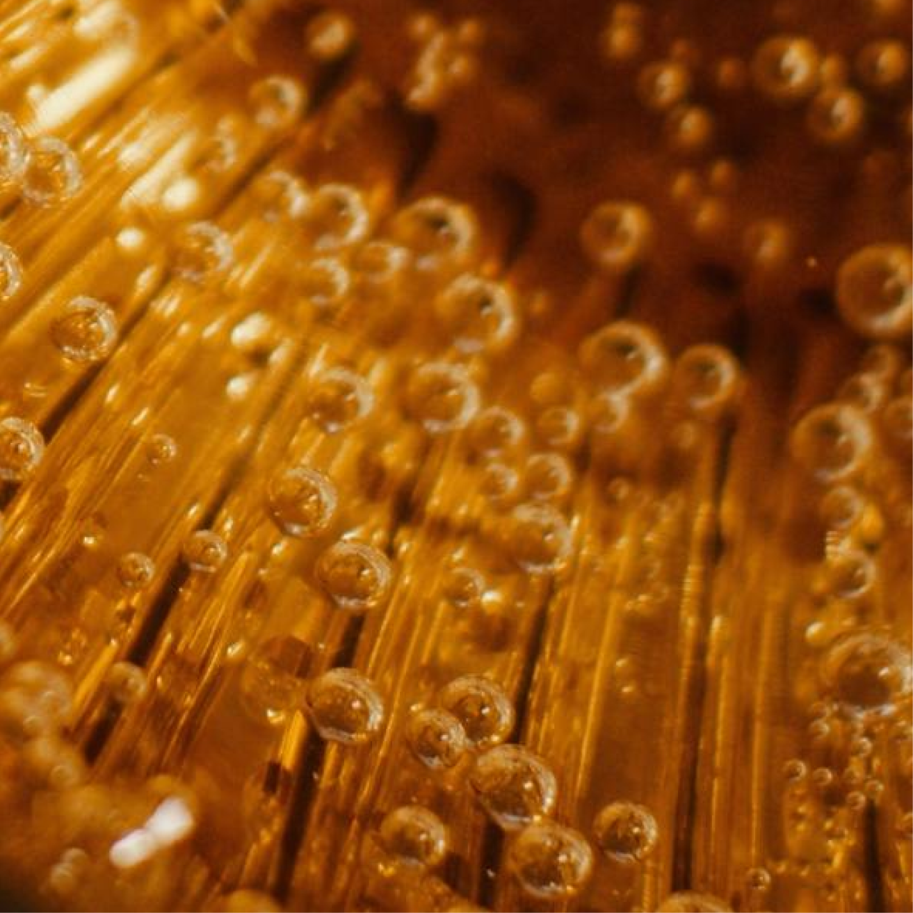
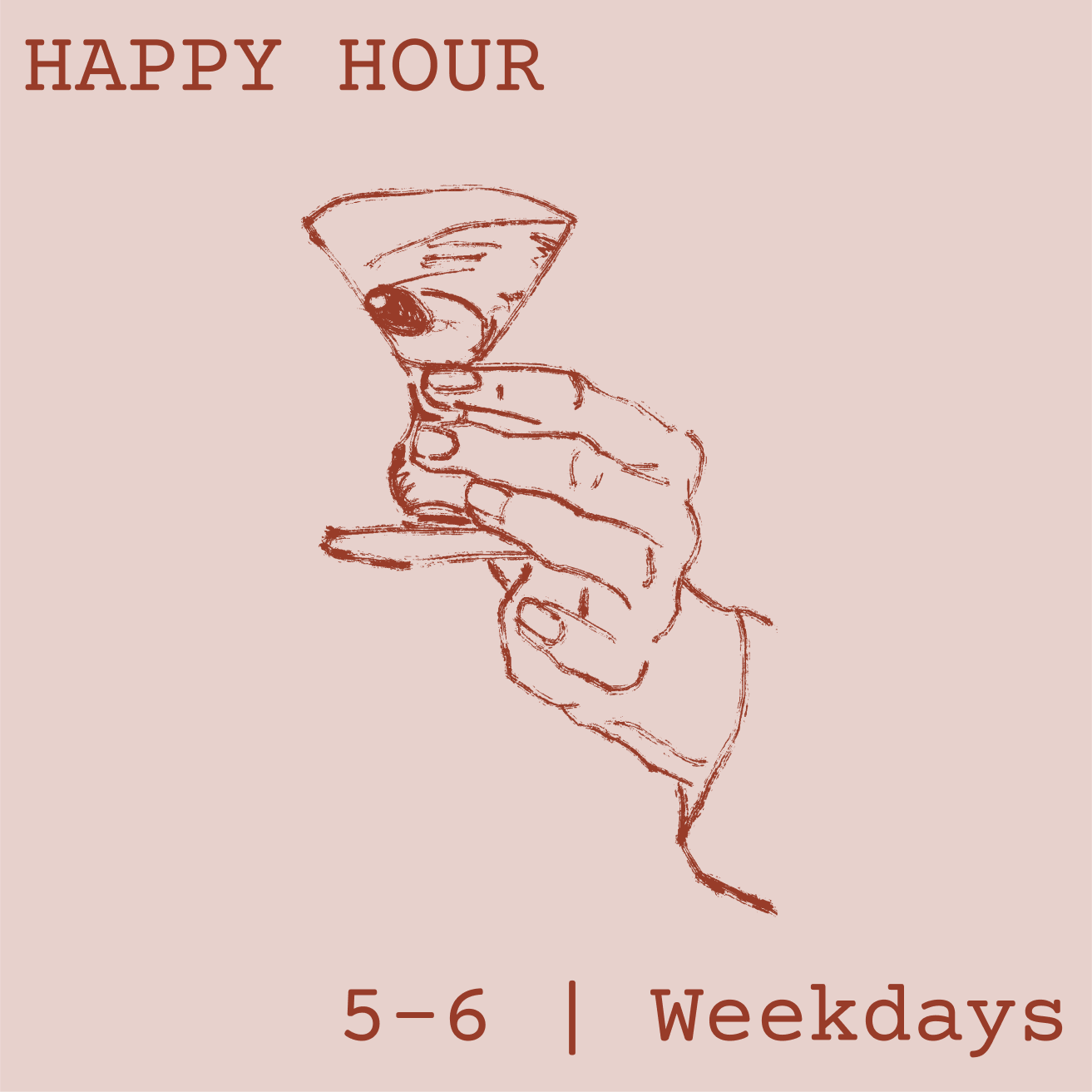
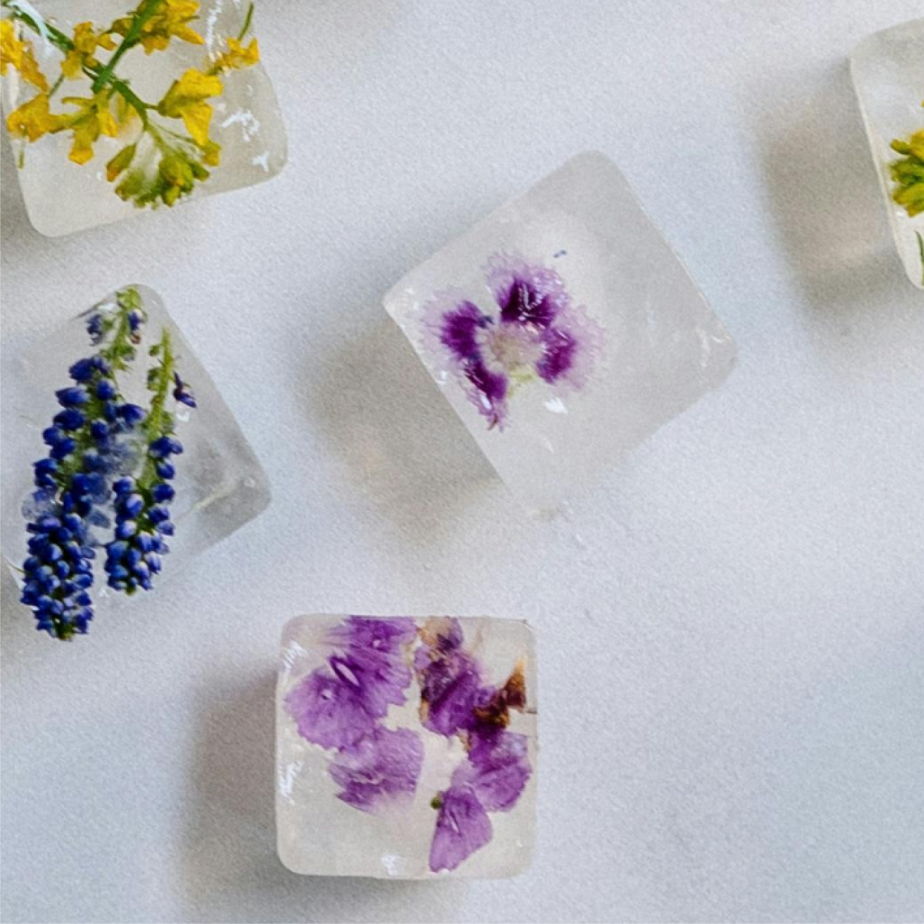
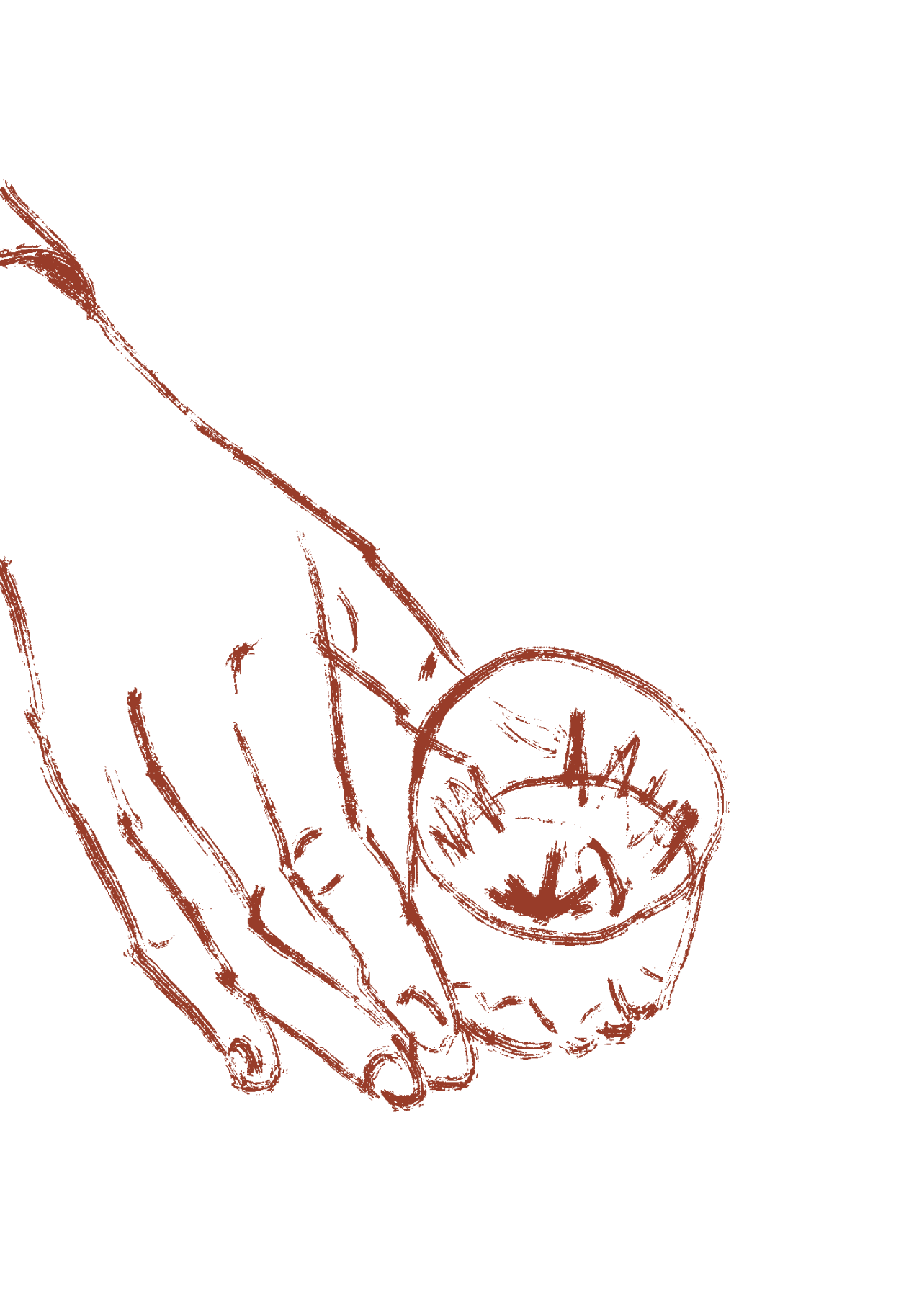
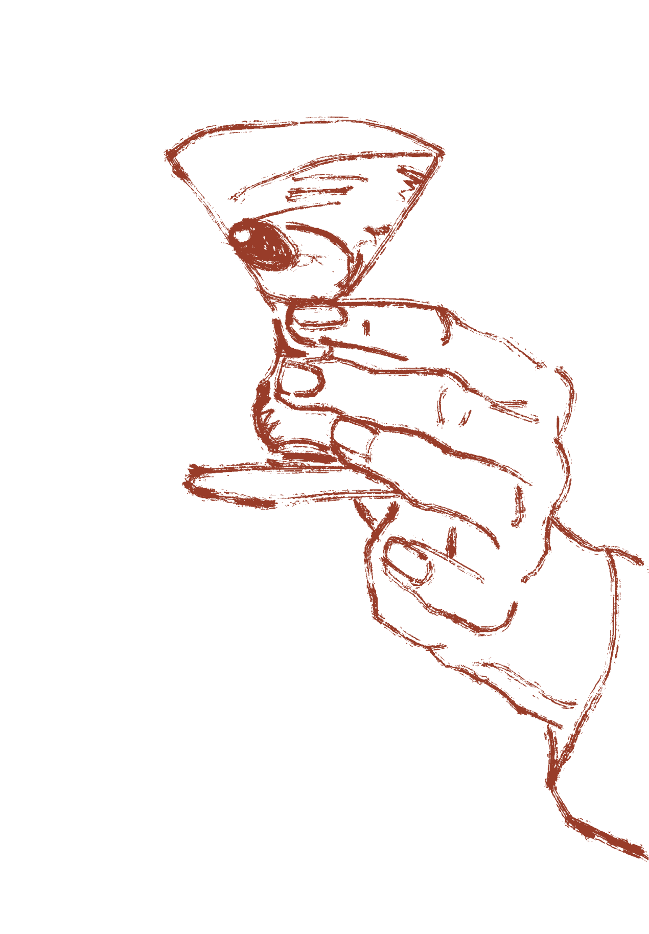
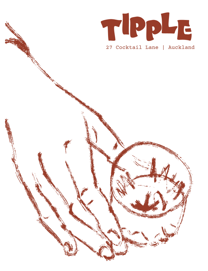
I also created an example of an instagram feed using stock images. Drink and ingredient imagery is included, along with illustrations. Hands are also included in some photographs and illustrations to draw attention to the 'hands' that create the drinks.
Digital Assets
Website Design and Instagram